Shares
Shares
Increasing interactions by 200%
Increasing interactions by 200%
Increasing interactions by 200%
My Role
End-to-end design
Industry
Fintech
Timeframe
6 weeks
Year
2024
A major re-design of the social experience that increased interactions by 200% and trading by over 80%
A major re-design of the social experience that increased interactions by 200% and trading by over 80%
A major re-design of the social experience that increased interactions by 200% and trading by over 80%
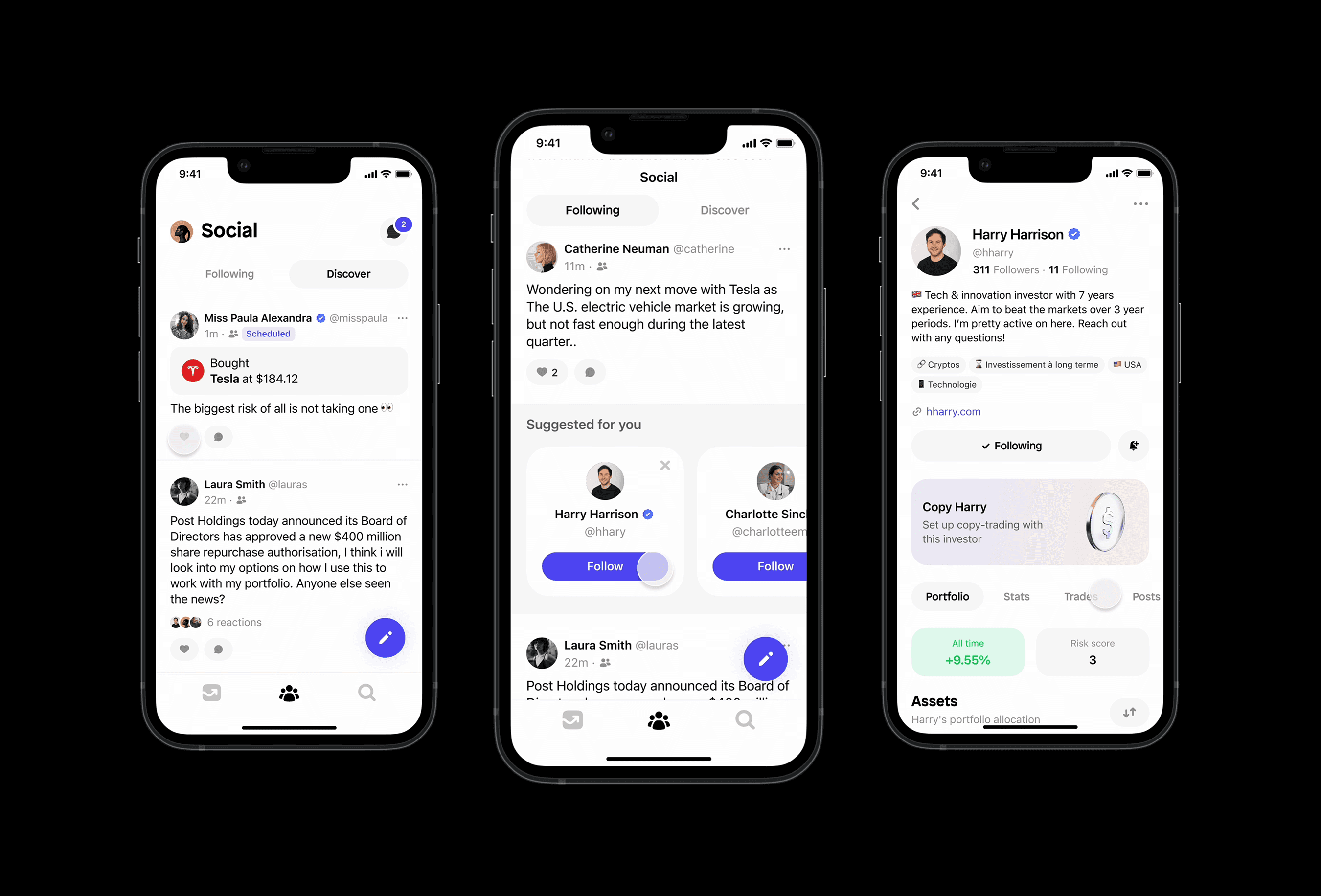
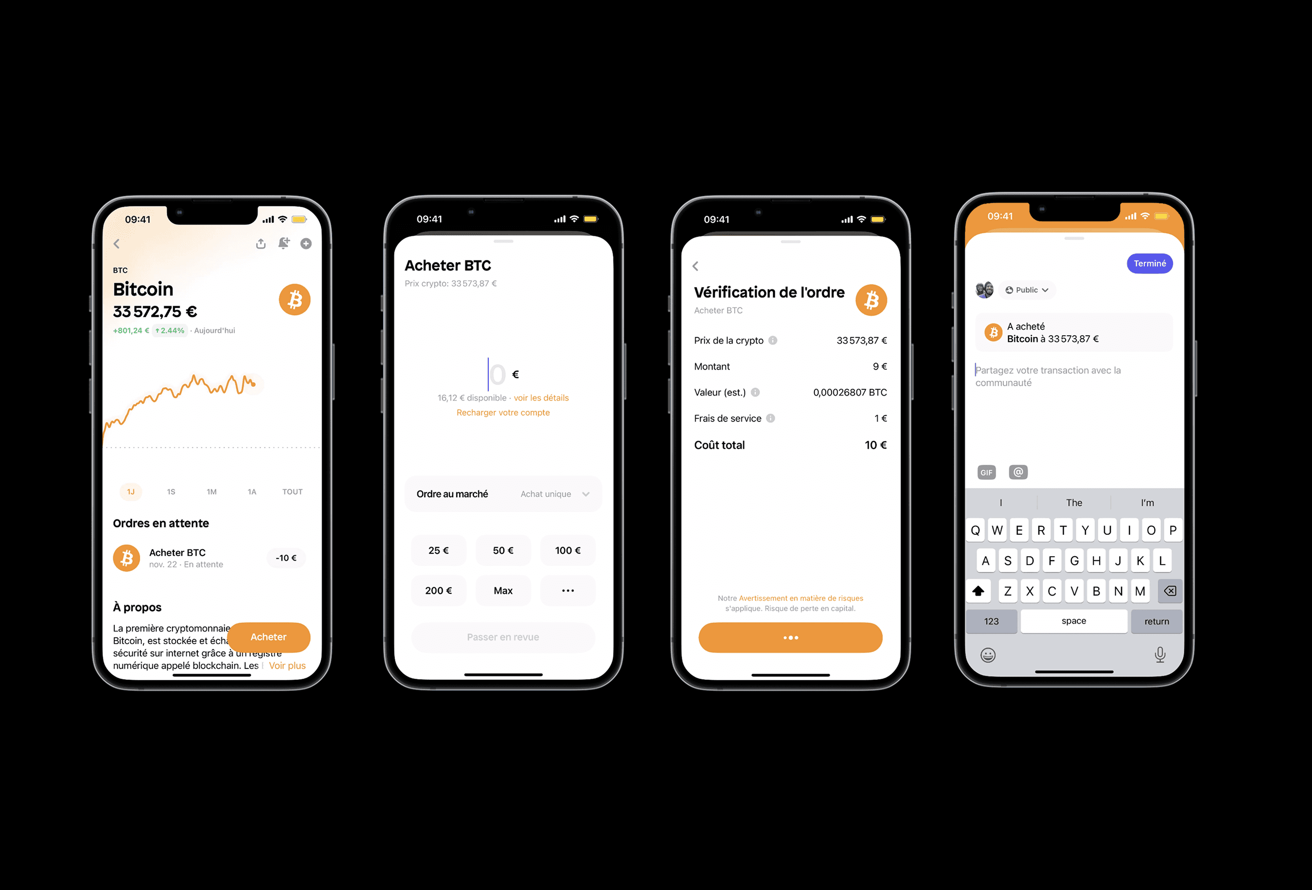
Shares is a fintech start-up offering a stock, ETF and a crypto platform designed like a social network, where I spent two and a half years pouring my time and vision into pixels. This feature was a major improvement towards one of the key pillars of this product's experience. Below shows the concept of Shares product. Read more about Shares
Shares is a fintech start-up offering a stock, ETF and a crypto platform designed like a social network, where I spent two and a half years pouring my time and vision into pixels. This feature was a major improvement towards one of the key pillars of this product's experience. Below shows the concept of Shares product. Read more about Shares
Customer problem
Customer problem
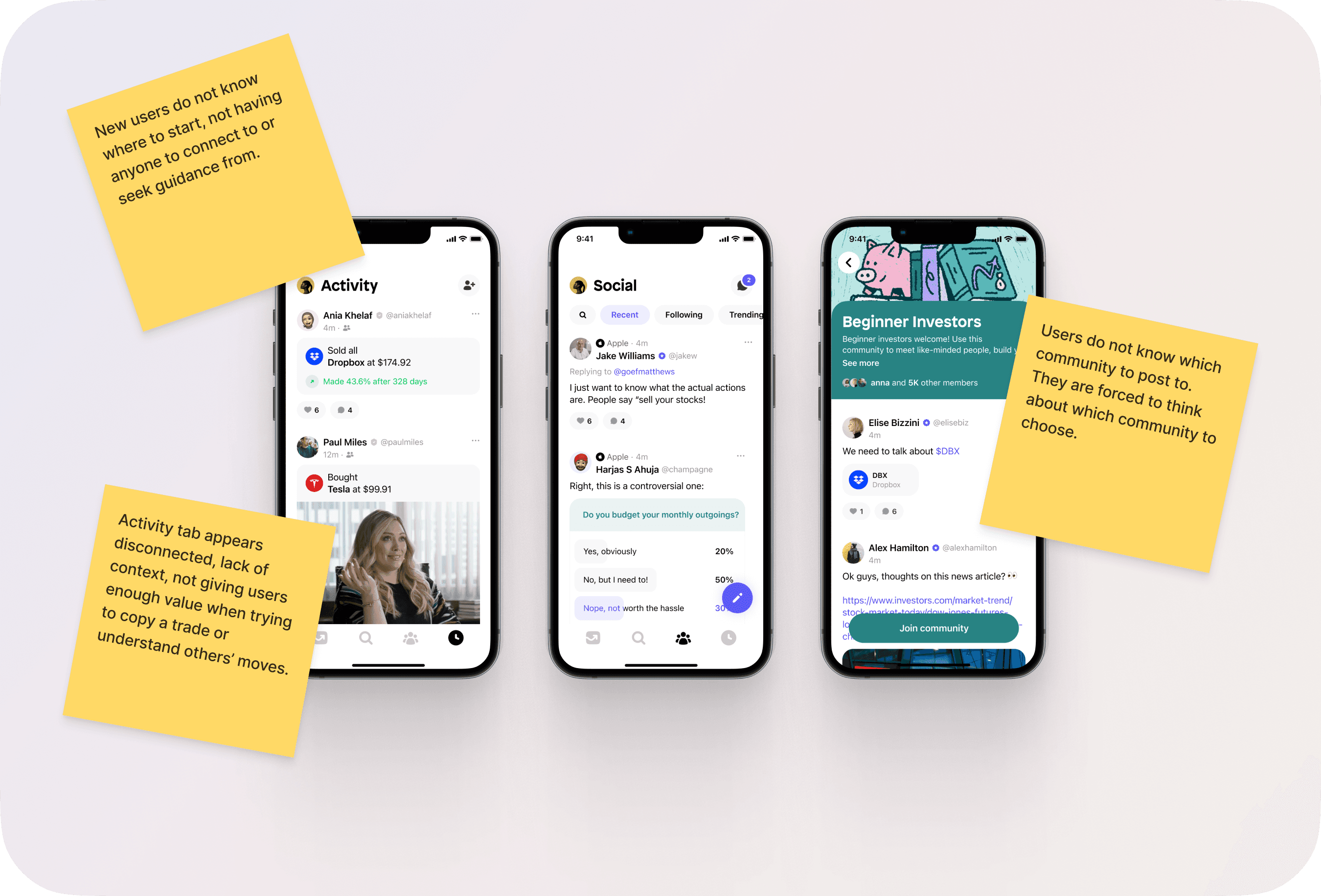
Users have been struggling with understanding the social space: which communities to join, where to post and what to post, so the social feed has not been bringing value.
Users have been struggling with understanding the social space: which communities to join, where to post and what to post, so the social feed has not been bringing value.
Business goal
Business goal
To increase trading on the platform and engagement on the feed.
To increase trading on the platform and engagement on the feed.
What was wrong?
What was wrong?
The idea of social investing had failed so far. Neither investors joining the app nor 'influencer' investors were benefiting from the set up. Everyone was confused and the initial design was not answering to user needs.
The idea of social investing had failed so far. Neither investors joining the app nor 'influencer' investors were benefiting from the set up. Everyone was confused and the initial design was not answering to user needs.
Process
Process
To understand the problems at hand, I started by working with the research team to dive deep into usability tests to gather user feedback on their current experience of the social space on Shares. I then identified user types on the platform and their needs (or goals) and pain-points.
To understand the problems at hand, I started by working with the research team to dive deep into usability tests to gather user feedback on their current experience of the social space on Shares. I then identified user types on the platform and their needs (or goals) and pain-points.
Key discovery insights
Key discovery insights
I gathered the research findings into key insights which would be the focus for this project. They were: Not all users want to post; there are too many communities to join and there’s not enough value in the Activity tab.
I gathered the research findings into key insights which would be the focus for this project. They were: Not all users want to post; there are too many communities to join and there’s not enough value in the Activity tab.
Usability testing
Usability testing
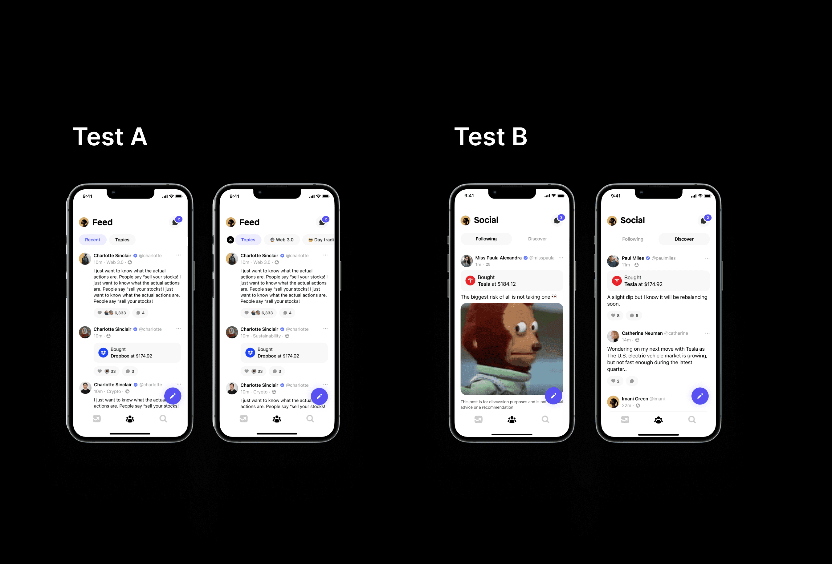
After ideating on different design ideas, I narrowed down to 2. I ran a usability test with our users, ranging from beginner to experienced to gather feedback on 2 varied experiences that I narrowed down to from previous explorations: based on filtering content by topics or by network. The simpler version (Test B) performed the best as users found it easy to understand and were not required to do any work in order to populate their feed.
After ideating on different design ideas, I narrowed down to 2. I ran a usability test with our users, ranging from beginner to experienced to gather feedback on 2 varied experiences that I narrowed down to from previous explorations: based on filtering content by topics or by network. The simpler version (Test B) performed the best as users found it easy to understand and were not required to do any work in order to populate their feed.
Re-structured UX
Re-structured UX
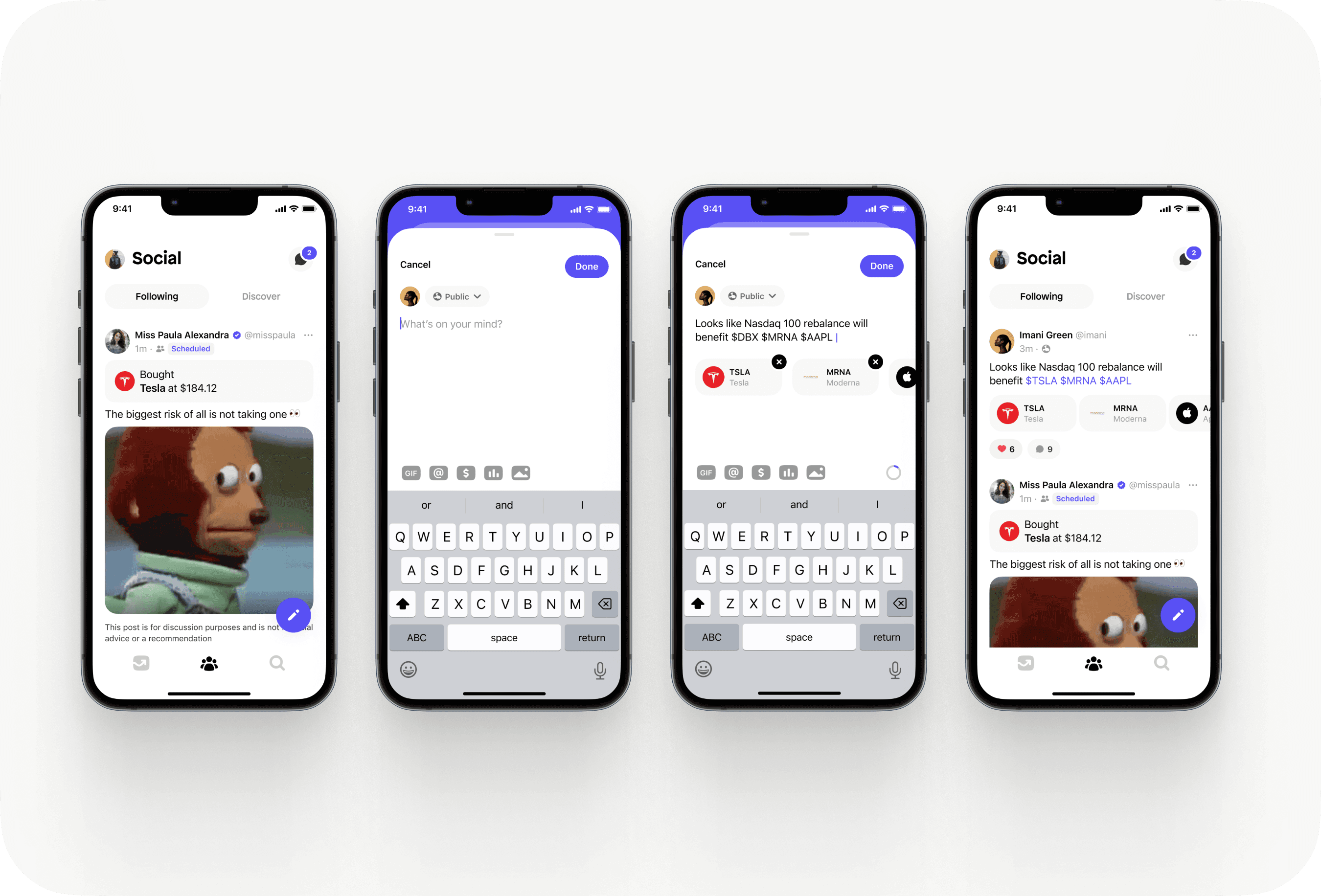
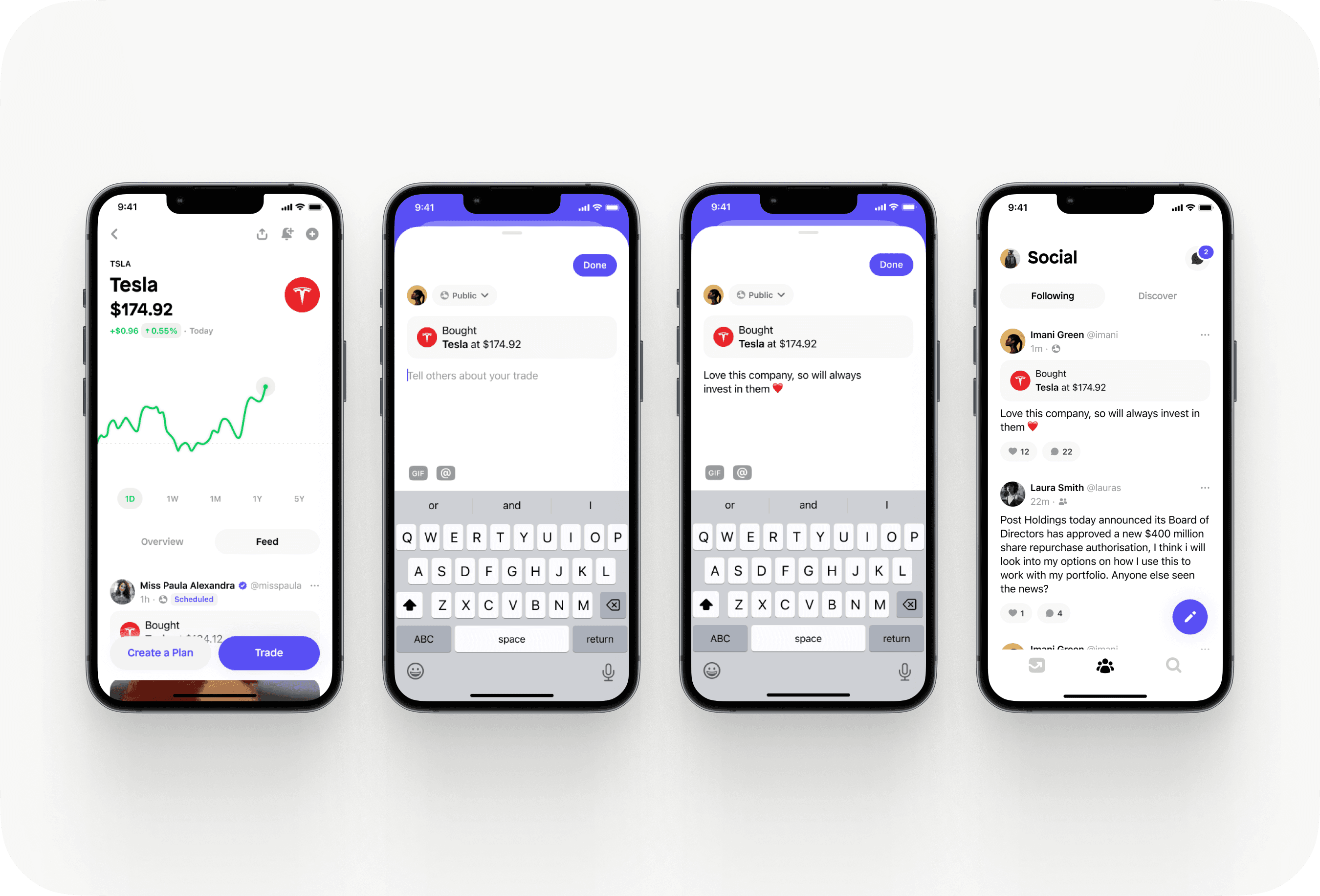
The final re-design featured a re-structured UX, incorporating posting and trading within the same feed and allowing users to add more context to their trades.
The final re-design featured a re-structured UX, incorporating posting and trading within the same feed and allowing users to add more context to their trades.
Impact
Impact
200%
200%
Of gifted asset trades
57%
57%
Increase in trades from feed in the UK
84%
84%
Increase in trades from feed in France
Learnings
Learnings
Initially, communities were designed with the intention for everyone to post, however, it’s been discovered that the majority of users want to be consumers of content.
Initially, communities were designed with the intention for everyone to post, however, it’s been discovered that the majority of users want to be consumers of content.
Next steps
Next steps
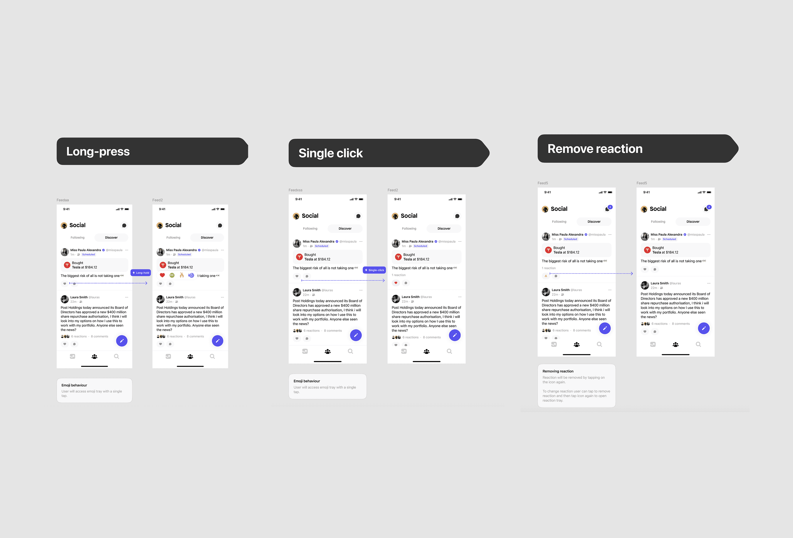
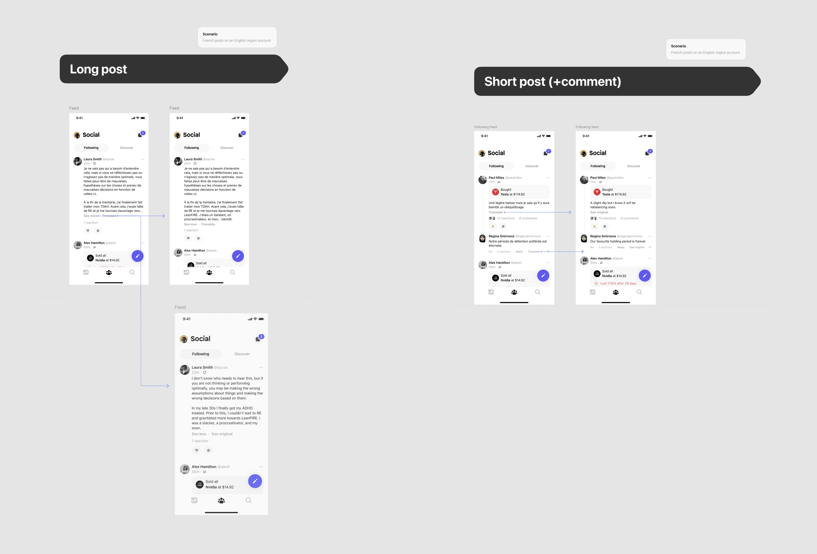
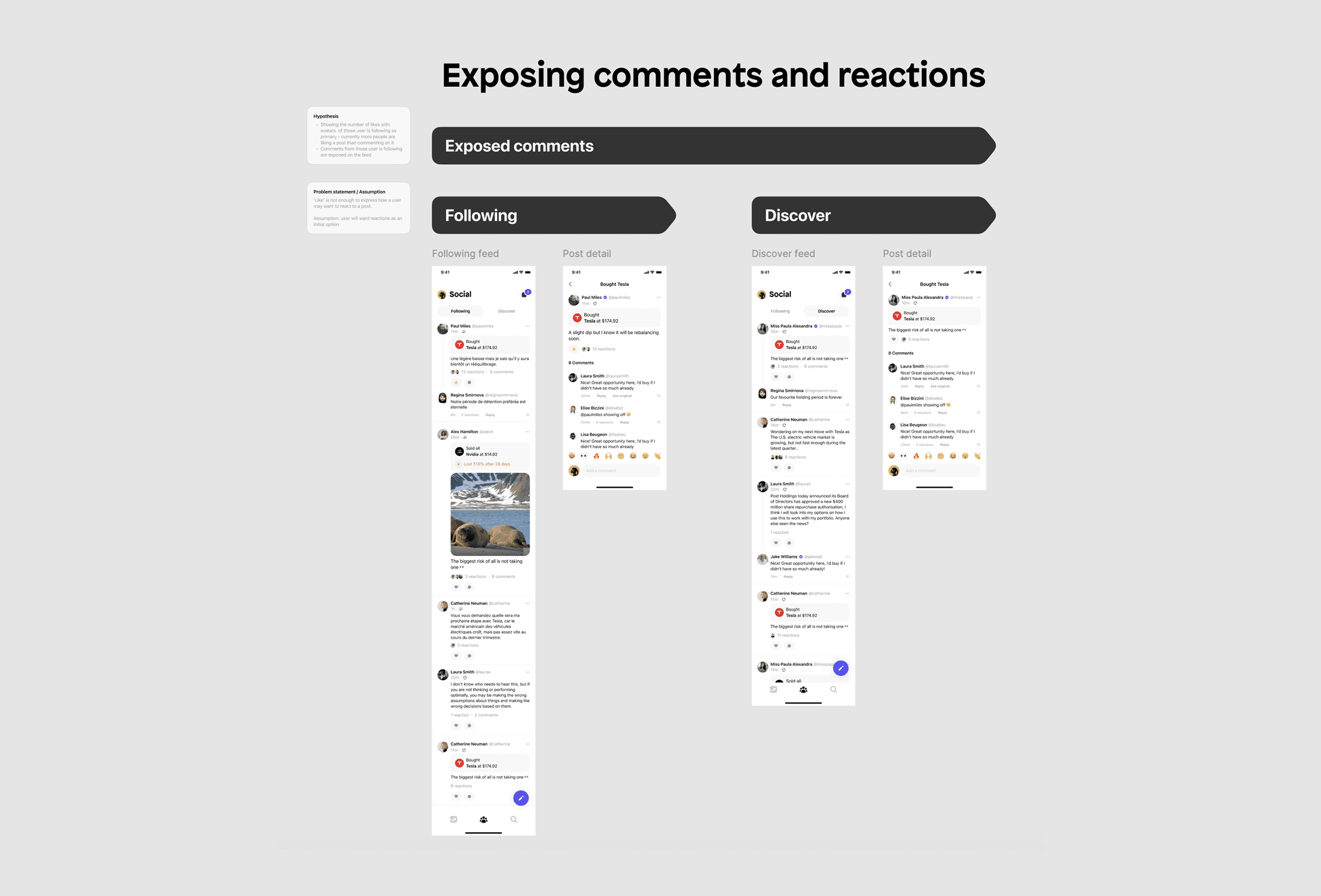
Following the successful launch of the re-designed social feed, I lead the discovery for the roadmap for growth for the feed. I worked on reactions on posts, translations and exposing comments and interactions on posts.
Following the successful launch of the re-designed social feed, I lead the discovery for the roadmap for growth for the feed. I worked on reactions on posts, translations and exposing comments and interactions on posts.
A more detailed case study is available upon request
A more detailed case study is available upon request
Next: Quidco →
Next: Quidco →
Next: Quidco →
© 2025 — Designed by Kristie
hello@kristiefigmints.com
© 2025 — Designed by Kristie
hello@kristiefigmints.com
© 2025 — Designed by Kristie
hello@kristiefigmints.com